A site report for any US address: measured demographics, dental-visit rates, and a verified count of the offices you would compete with. Every figure cites a public source. $29.99.
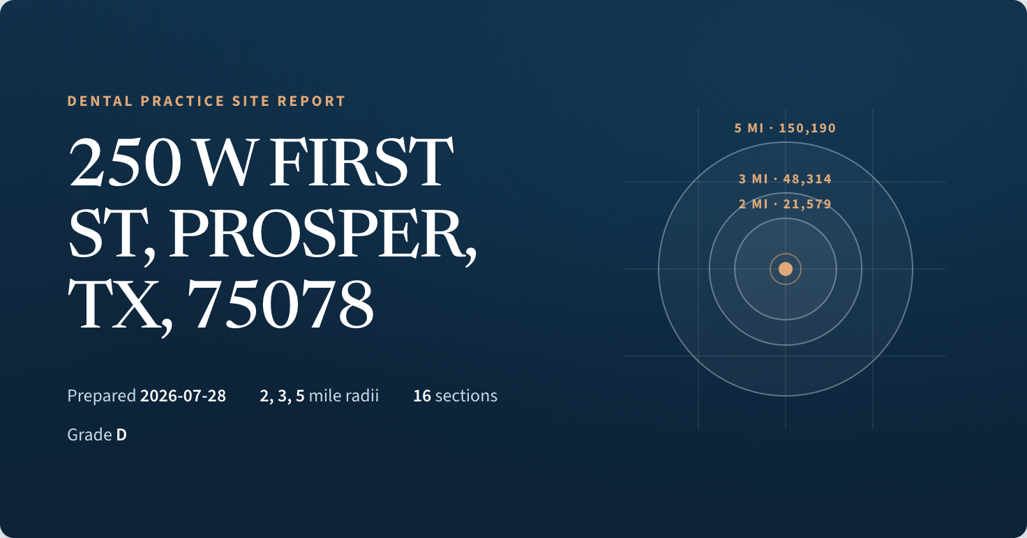
The sample report
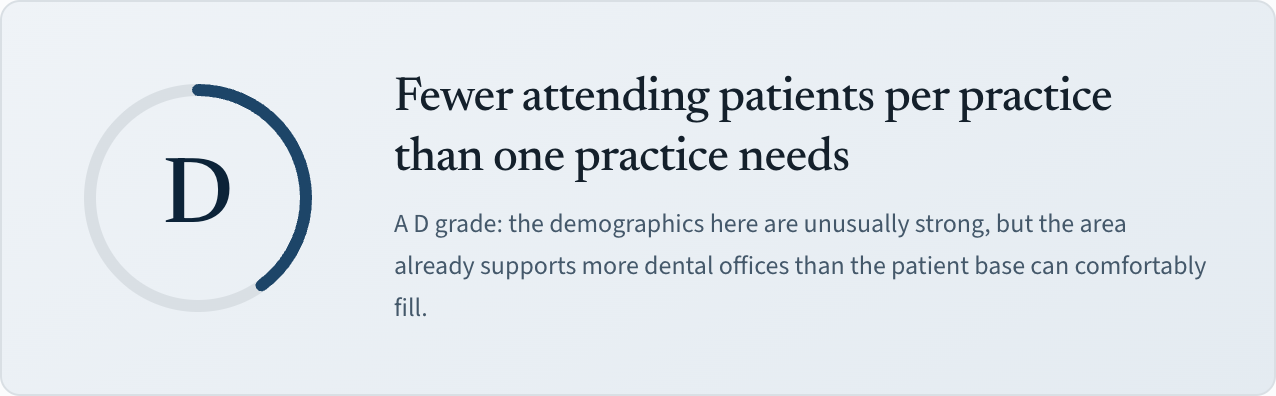
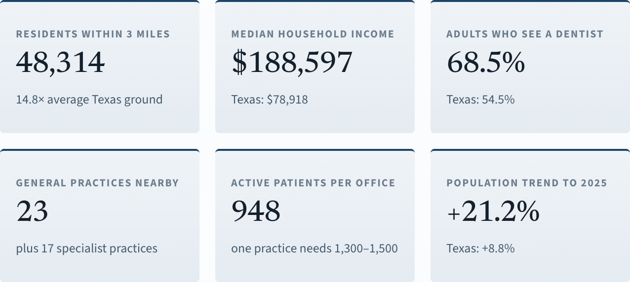
Prosper is the kind of market brokers circle on a map. Population up 30% since 2020. Median household income of $188,597 — 2.4 times the Texas median. 68.5% of adults saw a dentist in the past year, against 54.5% statewide. Wealthy, growing, insured, and dentally engaged.
23 general practices got there first. That leaves 948 active patients per office. One office needs 1,300 to 1,500.
Everyone reads the same growth headlines, and most of them arrived before you. The report exists to catch exactly this: a market where every demographic number is excellent and the competition math still fails. If a site is crowded, the grade says so plainly — nobody involved earns a commission on your lease.
What you get
The report is built around three rings — 2, 3 and 5 miles of drive from your address — because that is how dentists and brokers actually talk about a market. In rural markets the rings widen to 5, 10 and 15 miles, and the report says which set it used.
How it's built
The demographic half comes from the Census Bureau — the 2020–2024 American Community Survey on 2020 block-group geometry, apportioned into your rings with the margins of error carried through. Demand comes from CDC PLACES dental-visit rates. Growth is measured from the 2020 Census and the Bureau's 2025 county estimates.
The competitor half is enumerated: an adaptive map search that keeps subdividing until Google runs out of results, then address-level dedupe, then corroboration of each office against its website, its reviews, and the federal provider registry. Raw provider lists overstate real offices — we measured 2.49× at five miles — which is why they are enrichment here, never the count.
When something can't be measured cleanly, the report says so: censored income tracts, unverifiable listings, and any share of a ring with no published dental-visit rate are reported as caveats instead of being absorbed into the numbers.
Read the full methodology — every source, every vintage, every rule
Why this exists
I practice dentistry for a living. When I looked at the site studies my colleagues were buying, they mostly came from someone with a second interest in the answer — the broker listing the practice, the supplier outfitting it, the consultant selling the follow-up engagement. And the underlying counts were often provider-registry pulls that a phone call would have cut in half.
So this report has one design rule: every figure traces to a public dataset a lender can check, and the grade is allowed to be bad. The sample above is a D in one of the fastest-growing suburbs in America. That is the product working.
— the founder, a practicing dentist
Pricing
A practice location is a ten-year lease and a seven-figure loan, and everything sold alongside that decision is priced accordingly. That's the dental tax — the markup anything acquires the moment it's sold to a dentist, set against what you borrow rather than what the thing costs to make. Comparable reports run several hundred dollars. Theirs is not better data. It's the same Census, with your DDS priced in.
$29.99 is what it takes to cover the verified map data each report burns, keep the servers on, and stop the pipeline from being scraped by bots — cost plus a nominal margin, not a read on what you can afford.
Start with the free screening: type an address, get the ring demographics at no cost. The paid report adds the verified competitor census, the demand analysis, the grade, and the PDF.
Not happy with your report, or something in it is off? Contact support for a new report or a refund — your choice.
Questions
The Census Bureau (American Community Survey 2020–2024, 2020 Decennial, TIGER geometry, 2025 population estimates), CDC PLACES dental-visit rates, the federal NPI provider registry, and Google Places for discovering and corroborating offices. Every figure in the report names its source and vintage in the appendix.
Because the inputs are public and the pipeline is software. The expensive part of a traditional site study is a person assembling it; here the person-hours went into the method once, and every report reuses them. The rest of what those reports charge is the dental tax — pricing set to your loan, not to their cost. I pay it all day in my own practice; I'm not charging it here. And at $29.99 nobody needs to upsell you a favorable answer.
That's what the PDF is for: page numbers, a navigable outline, and a sources appendix citing the public dataset behind every figure, so a loan officer can check any number independently.
It won't pick your suite, model your production, or predict the future — the growth figures are measured history, clearly dated, not projections. It screens the market; the decision stays yours. And if enumeration hits a coverage gap, the report says so rather than pretending completeness.
Yes. Addresses you screen are not published, sold, or shared. The only public report is the Prosper sample on this page.
 Molar Metrics